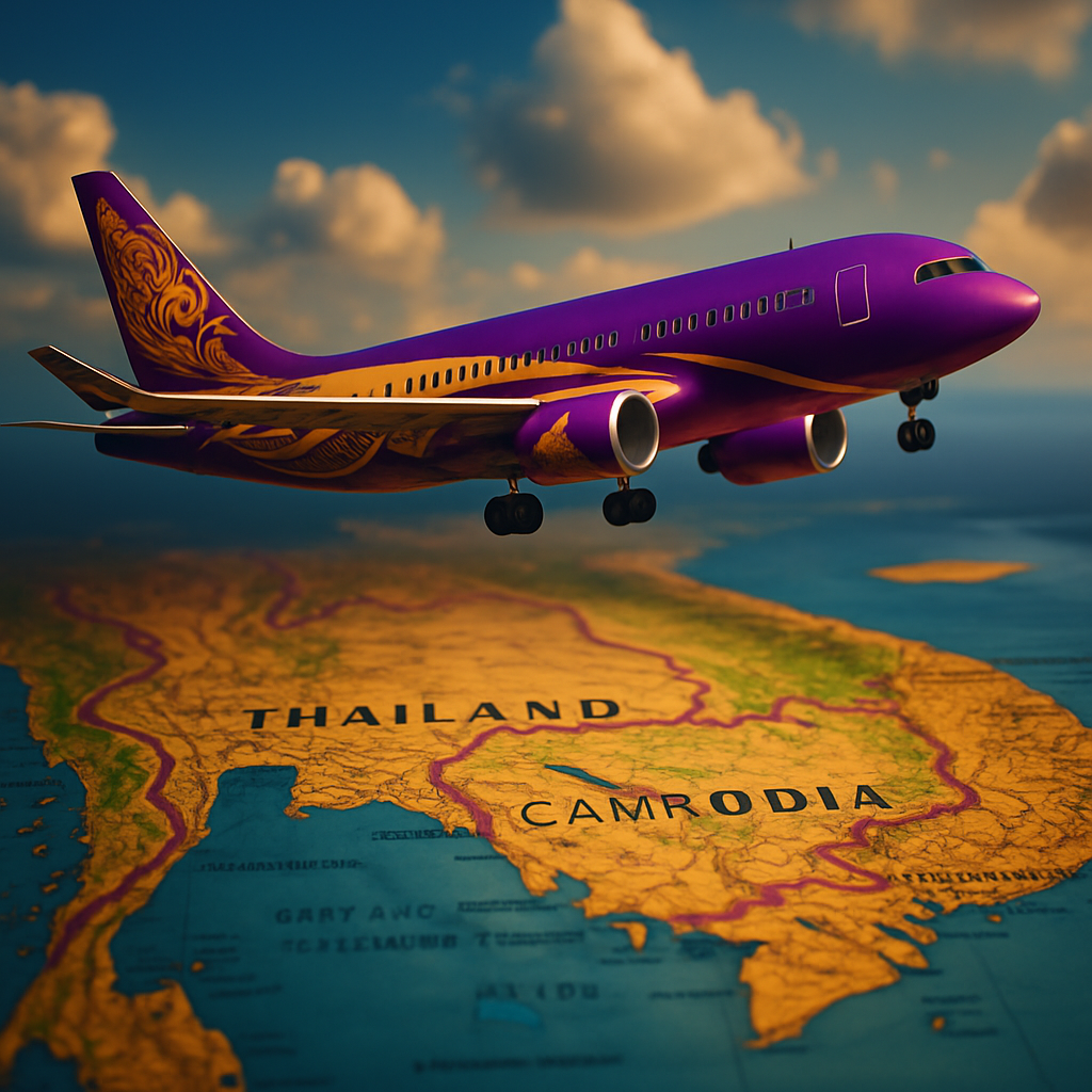
Air Cambodia, a fledgling force in the aviation industry, is soaring through the skies with a colorful poem of return to its cultural roots. Emerging strong amidst accusations of mimicking Thai Airways, Air Cambodia adamantly proclaims the originality of its chic purple-and-gold design as quintessentially Khmer. This spirited assertion comes in the wake of a social media tempest that erupted after the airline commenced flights between Shenzhen, China, and Siem Reap on July 18. Thai netizens quickly took to their keyboards to voice suspicions that Air Cambodia’s dazzling livery and neatly tailored cabin crew uniforms bore a striking resemblance to those of their beloved Thai Airways. Yet, the defiant national carrier of Cambodia might have just the right flair to diffuse these claims with effortless grace.
In a stirring official statement, Air Cambodia laid bare its stance, dismissing any allegations of imitation as purely coincidental. “All elements of Air Cambodia’s visual identity—aircraft livery, uniforms, and branding—have been independently conceptualized and developed in compliance with international intellectual property and aviation trademark standards,” proclaimed the bold declaration. Let’s not forget, this bird of Cambodian skies, once known as Cambodia Angkor Air, emerged anew as Air Cambodia Co., Ltd, unveiling its beautifully reborn identity on January 1. The rebrand signifies a “new chapter” which lovingly honors its legacy with poise, grace, and an unwavering spirit.
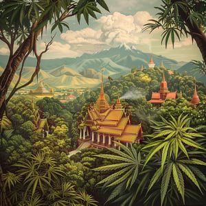
The recent cavalcade retained the airline’s longstanding regal hues of purple and gold, colors that resonate resoundingly with Cambodian identity. “Air Cambodia’s branding was developed through a deliberate and culturally conscious process,” the statement explains, adding how it reflects the kingdom’s venerable heritage and unyielding national pride. The striking purple is intended as a reflection of dignity, serenity, and devotion—a hue that draws inspiration from traditional Khmer aesthetics, and is said to arise from a symphonious blend of blue, red, and white, the colors of Cambodia’s national flag.
Adding a tad more nostalgic weight, Air Cambodia invites enthusiasts of aviation history to appreciate the lineage of its color scheme and emblem. Tracing back to the resplendent memories of its ancestor, the Royal Air Cambodge, the narrative connects with a brushstroke of historical splendor since 1956, a fact lovingly revealed by Khmer Times.
As the critical winds blew fiercer across the virtual skies, Air Cambodia tactfully approached the turbulence with a heartwarming call for diplomacy. With wings of calm, the airline urged civil discourse and advocated for regional cooperation. “Air Cambodia maintains a spirit of strategic partnership and mutual respect with fellow carriers across the region,” it eloquently stated. Committed to fostering regional aviation growth, the sentiment of collaboration and cultural exchange resonates throughout its messages.
In this digital age where every click can amplify like a sonorous note in the echoing forums of the net, Air Cambodia gently reminds the public to channel feedback through official pathways. Interaction outside this direct line could, like a rogue gust, misrepresent the rich tapestry of the brand’s heritage.
Amidst this swirling storm of aeronautical artistry, Air Cambodia stays airborne with panache, a place where dreams blend with tradition above the vibrant horizons of Southeast Asia.


I think Air Cambodia’s color scheme is a beautiful representation of Cambodian culture. Purple and gold are so regal, and they definitely have a unique charm.
Unique? Too close to Thai Airways if you ask me. It’s hard to believe it’s just a coincidence.
But can’t colors be similar in neighboring countries without it being imitation? Sometimes cultures overlap.
Exactly, Jonny! I think it’s more about celebrating the shared history and aesthetics of the region.
I’m just glad to see a Cambodian airline making strides. We should support them instead of criticizing.
As much as I love Cambodia, their colors do seem ‘borrowed’. It’s not just about colors—they’ve got to stand out in the industry!
Standing out in the aviation industry is tough, but why not borrow successful elements? Many brands do it.
Yes, borrowing can be flattery, but why not push for originality? It’s a marketing age, after all.
This controversy is so overblown. I flew with Air Cambodia last week and was impressed by how proud they are of their heritage.
Maybe, but imitation allegations can damage their brand if not addressed properly. Perception matters.
True, but I believe their transparency and cultural approach will win at the end.
Great for Cambodian pride, but shouldn’t the priority be customer service and safety?
Yes, but heritage and culture are part of a full package that makes an airline attractive.
People forgetting cultural heritage shouldn’t be a badge of creativity but an embrace of identity and history.
I just want affordable, safe flights. As long as Air Cambodia provides that, I’m happy to fly with them.
Cultural elements in corporate branding need to be balanced with modern sensibilities. That’s how you appeal to global customers.
Absolutely! Marrying tradition with modernity is the hallmark of a successful international brand.
The backlash is ridiculous. Can’t we just appreciate the beauty without nitpicking?
So intrigued by how cultural symbols impact brand perception. Air Cambodia seems to mix it well.
Can we focus on promoting regional collaborations instead of inflating differences? It’s just as Air Cambodia suggests.
Collaboration over conflict, always. Let’s grow Southeast Asian aviation together.
Yes, let’s celebrate diversity instead of sparking rivalry!
Proud of Air Cambodia and its rich color legacy that reflects our history. Keep flying high!
If it’s just a branding battle, then let’s see who markets better.
People are hung up on aesthetics but forget every airline pulls inspiration from somewhere!
Don’t care about who copied who. What matters is service quality. Will they shoot down their competition there?